New presentation to give? First stop: PowerPoint. Or Keynote or Google Slides. Regardless of your preferred design software, this is mental calculus that happens constantly in today’s world of work. That’s why, after email, presentation software is the most commonly used business communication tool.
Before we go any further, let me state for the record that presentation design software is a wonderful tool. It helps us bring our ideas to life and reinforce our words visually. And, unlike most design software (looking at you Photoshop and Illustrator), you don’t need advanced skills to use it.
However, here we run into our old friend Abraham Maslow. In addition to giving us a handy snapshot of our hierarchy of needs, the Brooklyn-born psychologist also popularized the concept known formally as the law of the instrument. But you probably know it by the familiar quote, “If the only tool you have is a hammer, it is tempting to treat everything as if it were a nail.”
So it goes with presentation visuals. We tend to treat every opportunity to speak in front of others as an opportunity to create a PowerPoint deck. In some cases, we even mentally fuse the two. But as presentation design expert Nancy Duarte says, “Slides should support your presentation, but they shouldn’t be your presentation.”
Visuals are essential. Allan Paivio’s dual-coding theory is the basis for the picture superiority effect. As I like to say, it’s the scientific evidence proving that a picture is worth a thousand words. More importantly, our pictures reinforce what we say in the hearts and minds of our audience.
But what pictures and visuals work best? And when?
The Right Slides at the Right Time
In the MBA Business Communication course I teach at the University of Iowa’s Tippie College of Business, I use Duarte’s book The HBR Guide to Persuasive Presentations. In it, she sketches out a simple X and Y axis to answer the question of what slides work best when. The X axis is audience size (small to large) while the Y axis is the formality and context of your presentation.
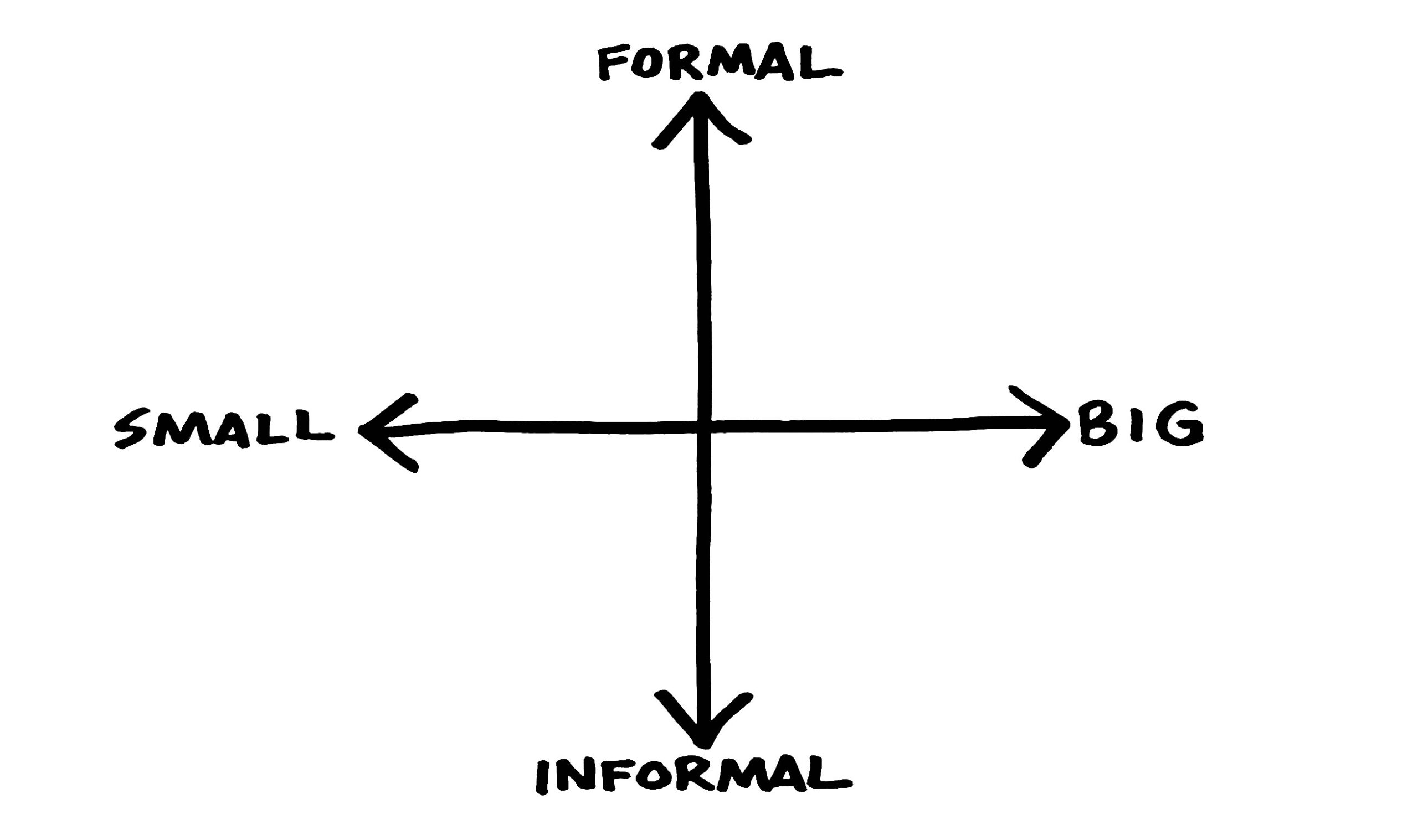
Any good consultative mind sees this and knows you can fill in those quadrants with relevant visual modes:
- Small audience, informal setting — You may not even need slides as this is more of an interactive discussion. If there is information to exchange you might use slides to create a read-ahead or a leave-behind.
- Small audience, formal setting — A shorter slide deck with more time at the end for discussion.
- Large audience, formal setting — A formal slide deck, rehearsed and delivered as a polished keynote. FYI: this is the type of deck we make for most of these meetings and that’s a problem. This is why, according to the Harvard Business Review, at least 50% of our presentations are misaligned with their intended audience.
- Large audience, informal setting — Huh? How is it big yet informal? Think of a pre-recorded formal presentation that your audience is watching asynchronously.
Bottom line: Not every presentation requires a full, formal slide deck. Take a moment first and think about your setting and what it is your trying to do. One size does not fit all when it comes to presentation visuals.
Slides Aren’t Your Only Visual Tool
So, we’re overusing and in some cases misusing the hammer that is slide software but it’s far from the only tool in our visual communication toolbox. Dan Roam’s books Back of the Napkin, Show and Tell, and Draw to Win encourage us to put down the slide clicker and embrace simple sketches to tell business stories and visualize solutions.
In fact, the title of Back of the Napkin is rooted in the origin story of Southwest Airlines. Legend has it that co-founder Herb Kelleher sketched out the idea for a new intrastate airline connecting Texas’s three largest cities—Houston, Dallas, and San Antonio—with a simple triangle on a cocktail napkin. In the case of Southwest, the picture was worth a thousand words and big bucks.
But sketching is scary. Many have flashbacks to elementary school art class and fear that our pictures won’t be as good as those of our classmates. However, if we can shed this baggage, we have a powerful tool that can help us bring our ideas to life visually and instantly.
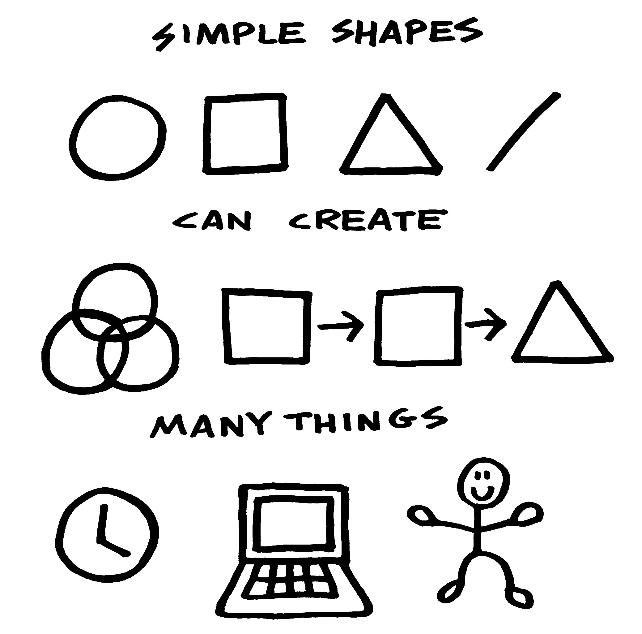
Simple shapes like lines, dots, arrows, squares, triangles, and circles are the basic building blocks that allow you to draw simple objects and processes like Venn diagrams and process flows.
When you stand at the whiteboard and sketch out simple shapes, you can:
- Lead — Sharing your vision and inspiring people to follow it.
- Sell — Visually how your products can solve people’s problems.
- Innovate — Illustrating better paths forward.
- Train — Showing people how to do things.
With some practice, you have simple drawings that add a memorable human touch to your work. As Dan Roam writes, “Hand-drawn pictures make people smile, and smiling people think better.”
Growing up I drew all the time. I filled sketchbooks with things I saw on TV, in the world around me, and, best of all, things that came from my own head. Then I grew up a bit and stopped. Drawing pictures isn’t what serious grownups do. When I spoke with Roam on my podcast, I learned that I wasn’t alone. “We drew when we were kids when we couldn’t write as well. We drew pictures to tell stories. But we lost it somewhere along the way.”
After a few decades away, I picked up a Sharpie and illustrated my two books. From there, I started adding illustrations to my presentation slides and online articles. But it’s taken time and practice to not just open the software and start smashing slides together mindlessly.
Powerpoint and comparable presentation design programs are great tools. But we shouldn’t use them the same way in every single setting. They’re also not the only tools we have. Pictures are worth a thousand words and sometimes the best pictures are the ones you draw in the moment in front of others that help you bring your ideas to life.
