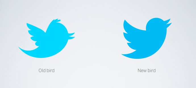
This blog sits at the intersection of branding and social media. There’s nothing more in the crosshairs of this thesis than the branding of a social network. Last week Twitter unveiled a new logo. A new bird really. When discussing this with people, I’d point to the new logo on screen and was often met with baffled glances.
Indeed this is a very subtle logo update. Basically, they scrapped the logotype and streamlined the bird itself, giving him a cleaner line and an uplifted focus. While this may seem like a little thing (a simple act of bird watching?) let’s take a look at what this new bird is all about and what you and your brand can learn.
A Teaching Moment
With the advent of the social web, logo rollouts have become major online events. These unveilings have become a time for the echo chamber to pick apart creative work, sometimes with merit and other times because it’s easier to destroy than create. As such, there’s often a teaching moment we can take away as brand builders.
The teaching moment here? It went off just fine. Sure there was a meme that rippled through peoples’ feeds on Wednesday but beyond that, no one really cared. One could argue that there isn’t really a teaching moment here at all. I disagree. In fact, there’s a lot to learn because Twitter did a lot right.
A Minor Variation — The most critical I can be is that the change is pretty minor. However, the masses are often rankled by big change. This facelift to the Twitter bird is relatively unnoticeable to those outside the industry who don’t stare at the bird every day like some of us do.

Timing — The timing was also right. As Edison Research’s recent data revealed only 10% of Americans use Twitter yet 89% know of the existence of tweets. If you consider Rogers’ Innovation Adoption curve, Twitter is probably on it’s way to hitting the majority in a big way. (Edison’s new Social Habit report reinforces Twitter’s increasing adoption as well.)
What impact do these numbers have on the brand? If you are considering a logo change, now is the time — while only 10% interact with the network regularly and before use explodes even further.
Just the Bird, Ma’am — Twitter is also making a bold statement on the type of brand it wants to be. Beyond streamlining the bird and giving him an upward, forward-thinking flight, they’ve also eliminated the (awful) bubble logotype and replaced it with — nothing at all. While most brands feel the need to spell it out for us (especially in the tech sector), Twitter is taking a cue from Nike, Apple, and Starbucks by dropping the logotype all together in favor of iconic status. As they said on their blog announcing the update: “Twitter is the bird, the bird is Twitter.”
Stories Matter — People like stories. Before the interwebs, stories were the original form of social media. Even today, brands with good stories endure. For example, take a look at Apple — the most-revered brand of our age. Most people know at least one Apple or Steve Jobs story. Stories matter with logos too. And Twitter had a good story around the update:
Our new bird grows out of love for ornithology, design within creative constraints, and simple geometry. This bird is crafted purely from three sets of overlapping circles — similar to how your networks, interests, and ideas connect and intersect with peers and friends. Whether soaring high above the earth to take in a broad view or flocking with other birds to achieve a common purpose, a bird in flight is the ultimate representation of freedom, hope and limitless possibility.
If you’re one of those lazy, visual-learning info snackers (I kid — I’m one of them) they also created a cool video literally showing the logo as the confluence of three sets of simple circles:
Not only is this a good story, it’s a story that’s consistent with their brand as well. Twitter has thrived on doing one thing — 140 character updates — very well. Laser-like simplicity. This logo continues the brand’s story of focus and simplification.
Trace this concept back to the most recent botched logo rollout, The Gap, and one could argue that the lack of story or purpose was a big part of why they failed. When people responded negatively (and there will always be some), The Gap couldn’t explain why they did what they did. Worse yet, they immediately backpedaled. Whereas Starbucks, like Twitter, simplified with reason. They removed the word ‘Coffee’ from their mark as a signal that expansion beyond java was on the horizon.
Dust-Off the Soapbox
We spend so much time online tearing new things down — especially branding. I don’t think there’s nearly enough energy spent patting brands on the back that get it right. Even if the new Twitter bird isn’t up your tree, you have to admit that they at least got the rollout right.
What You Need To Do
Some clerical items. If you use official Twitter buttons, the new logo has probably already been pushed out to you. If you create your own, you’ll want to grab the new logo. I’m a big believer in getting the most accurate form of a logo on your badges. Maybe it’s a little thing but I think it shows that you’re attuned to the channel and didn’t just slap something on to show that you’re social.
What About You?
What do you think of the new Twitter logo? Moreover, do stories really matter or are they just for the marketing echo chamber? I’d love to hear your thoughts and opinions in the comments below.

