Last week the World Wide Web Consortium (W3C) rolled out a new logo, identity system, and website for HTML5, the next major revision of the HTML standard. Here’s an interview I did with Michael Nieling and Jeff Hamlett of Ocupop, the team behind this launch.
The challenge you were presented with from W3C was ‘How can we better communicate the potential that HTML5 represents?’ Tell us how establishing a strong visual vocabulary accomplishes this goal?
Well, the question wasn’t just that – in as much as this logo, and the effort in general, is not just about potential – it is about very real technology that in many cases can and is being used right now all over the web. The logo and the system around it not only aims to build excitement around the possibility the next generation of web apps hold, but to also lend excitement and coherence to the movement happening right now all around us.
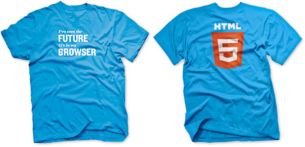
By establishing a standardized identity representing HTML5, W3C has created a touchstone for technologists, writers, designers, and the public at large to use when referring to the cornerstone of modern web applications. Examples of this standardized visual vocabulary doing its job already are conferences and events utilizing the logo to advertise topical programming, blog posts and publications exhibiting the logo to provide immediate visual context for their content, developers and agencies using the logo when sharing the excitement and potential in these technologies with collaborators and clients, and the thousands of individuals rocking the t-shirts to show their pride as part of the open web movement.
What’s the elevator speech behind the new HTML5 logo?
Not sure a logo gets an elevator pitch … they’ve got to speak for themselves. But if charged with ‘selling’ this logo in 30 seconds or less, I think it would be safe to say that this quote from our portfolio page does a pretty solid job –
The HTLML5 logo goes beyond simply representing the HTML5 spec to embody the technology, and the open web movement, at its core. This starts with standardization — the logo and its progeny follow very strict geometric rules providing an incredibly adaptable yet stable and stylish identity. As you’ve hopefully seen out on the web, the logo, the icons, the colors and the type all work, and work well, in nearly every imaginable context (and probably contexts beyond our imaginations). From favicons to billboards, this mark was designed to hold together in the face any manipulation. Through simple adjustment of hue, the logo conveys incredible depth and dimension without dated or awkward flourishes. With just two shades of orange and two shades of gray, the standard logo offers a thoroughly refined and assuredly lasting visual impact.
The term ‘HTML5’ has been out in the wild on its own for awhile. Were there any perceptions or preconceptions that presented challenges in building a cohesive brand?
There was, and is, significant discussion over what the term ‘HTML5’ means, and what it should mean. As a design and marketing company we can only comment on our perceptions and the justification behind our work, but it is safe to say that this is a conversation that has been going on for some time and will surely continue amidst the passionate populace shepherding in the future of the modern web.
That being said, the term ‘HTML5’ has assuredly taken on meaning far beyond simply describing the spec – whether you call it a collection of technologies, a movement, a cornerstone, or, god forbid, a buzzword – ‘HTML5’ has become part of the vernacular of our time … and without HUGE advertising campaigns or debeers-ian sociological efforts, you can’t really change vernacular … you can only leverage it. So ideally, this logo, and the identity around it, serves to anchor the conversation and helps all of the parties mentioned earlier to build excitement, awareness, and momentum for the greater base of next generation technologies moving forward.
Did you approach the HTML5 project differently than a typical identity project given that this brand is meant to be a universally adopted standard?
So, ask any logo designer with any experience ‘what is the key to developing truly iconic identity design?’ and you’ll get the same answer every time – simplicity. An elegant, efficient logo that works well in black and white and in color, at tiny sizes and at huge sizes, with a logotype or without, should always be at the top of any ID project’s wishlist. But in this case, this tenant of our craft became exceedingly important when considering the prospect of universal adoption, and even more so, unfettered usage. With the logo being licensed under Creative Commons it is freely available for anyone to use as they see fit, so obviously it was paramount that the design carried all the impact and import described above but in a way that was simple, streamlined, and resilient in the face of relentless ‘remixing.’ So as you can see when you look at the logo, the foundation of the design is standardized and simple – there are no complex flourishes or elaborate visual adornments and it is all adheres to a common math – but the overall impact remains decidedly sophisticated and dynamic.
In less than a week, the HTML5 logo has already been used on thousands of websites, versions of it have been created in CSS, JS, SVG, and even flash, and we’ve seen dozens of posters, apparel items, and swag rolled out – and I am confident in saying the logo is holding up exceedingly well – and I am very proud of the restraint in execution it took us to get to that end result.
As you mentioned, in addition to badge building, another big part of the HTML5 logo site is gear — t-shirts and stickers. What’s the role of merch in building a brand movement like this?
Pride and solidarity is key to any grassroots movement – whether it is technology, politics, music or whatever – showing your colors is at the core of building momentum and sharing excitement, and HTML5 is no different. In just one week, there have been well over one thousand shirts shipped out, thousands of stickers distributed, and as I said above, dozens of other sites springing up offering everything from HTML5 can coozies to underpants, so obviously there was a hole in this community that the HTML5 merch has filled and it is really exciting to see the enthusiasm and pride building because of it.
Admit it, you want a shirt. Hoodies and some new shirts I think are coming out this week as well.
I do want a shirt.
You can learn more, create badges, and purchase gear on the HTML5 logo website. In the interest of disclosure Jeff Hamlett of Ocupop themed this site and collaborates with Westergaard on web projects.


